
Avail
Creating an app that helps BC Students Claim the Benefits they’re already owed.
My Contributions
Research
UI/UX Design
Prototyping
User research
Responsiveness
Design system
Duration
4 weeks
Team
2 UI/UX Designers (me)
1 Developer
Tools
React Native, Expo, Anthropic Claude API
Overview
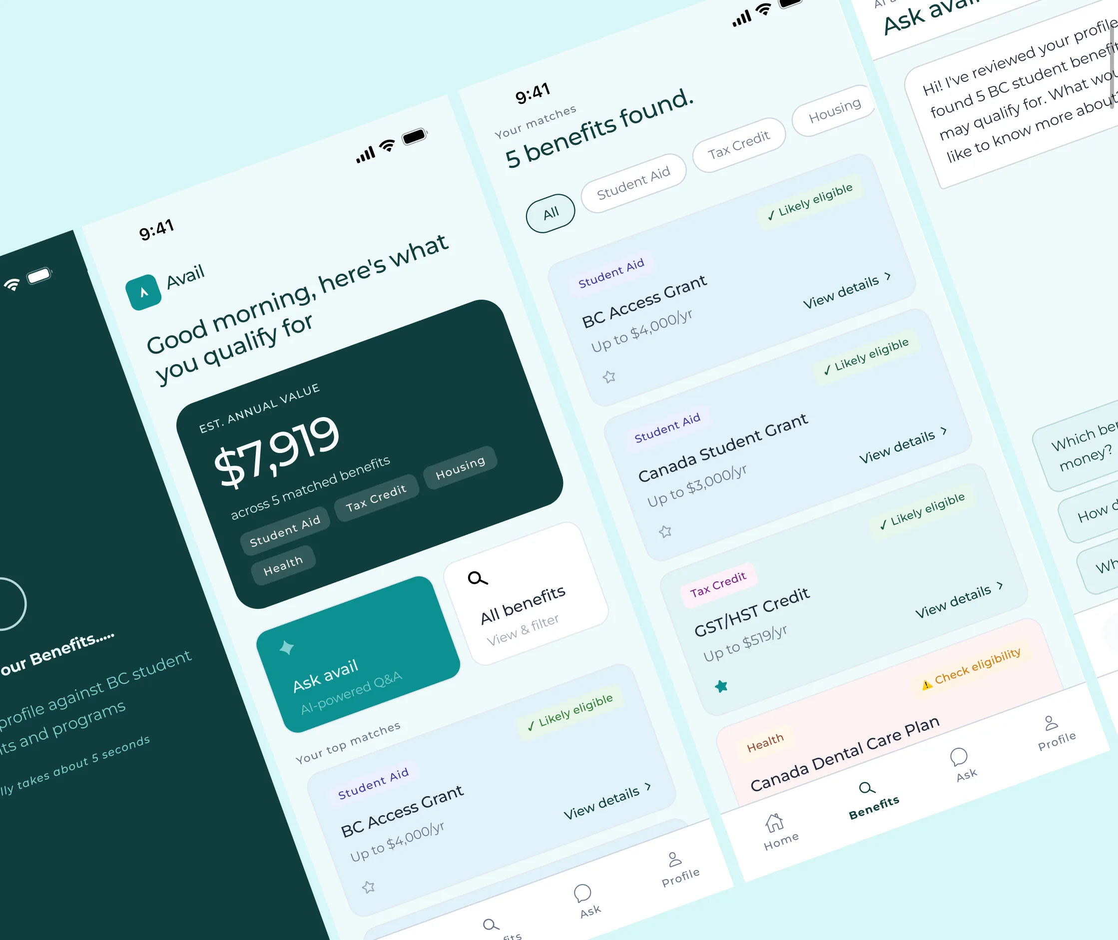
Avail is a mobile-first tool that matches BC students to benefits they didn't know they qualified for, built as a final project for a BCIT app development course. It walks a student through a short quiz, matches them with BC benefit programs using AI, and provides results they can browse, filter, apply, or ask follow-up questions through Ask Avail, an in-app AI chat assistant. The app is functional, not just a static prototype, and runs on Expo. The demo below is what the running app looks like.

Problem
People have missed out on close to $9B in benefits over five years, simply because they don’t know the programs exist.
$9B
Canada’s Parliamentary Budget Officer found benefits missed by people who don’t file taxes add up to about $9 billion over five years, roughly $1.7–1.9B a year. People aren’t ineligible, they just don’t know the programs exist, the gap Avail’s matching and explanation screens are built to close.
Existing tools cover parts of this. Canada.ca’s Benefits Finder is a web checklist with no explanation of why a result matches. KOHO speeds up access to benefits you’re already approved for, like early CRA payment access, it doesn’t help you discover ones you haven’t applied for. Avail combines discovery with reasoning: mobile, student-specific, and explains why each match applies.
Discovery
Feedback from government contacts, reached through user research, forced us to rethink who this was actually for.
Our original proposal covered federal and provincial benefits for all Canadians. During our brainstorming phase, our instructor took the proposal to contacts in government for feedback, helping direct us to a more achievable outcome in a shorter time frame, as we only had 4 weeks until the deadline.
“No single ‘centralized’ system exists across federal and provincial benefits. You’d be better off narrowing your scope, province vs. federal, and one population vs. others.”
— Feedback from government contacts
The response flagged a problem we'd missed: federal and provincial benefits come from separate systems with no existing shared API. Matching across both in 4 weeks meant giving answers we couldn't verify. The closest thing to a real data source turned out to be province-only, and even that took stitching together separate open datasets.
With this new information, we pivoted to focusing on only BC student benefits: one province, one population, a defined set of programs with public eligibility data. This helped simplify our project scope.
Ideation
Established the token system and validated core layout patterns before moving into individual screens.
With two designers splitting screens and one developer waiting to build, there wasn't room for our styles to drift apart mid-project and get corrected later. Before splitting screens with my co-designer, I built the token system: colour, type, spacing, states. One source, so neither of us had to reconcile our own version later.
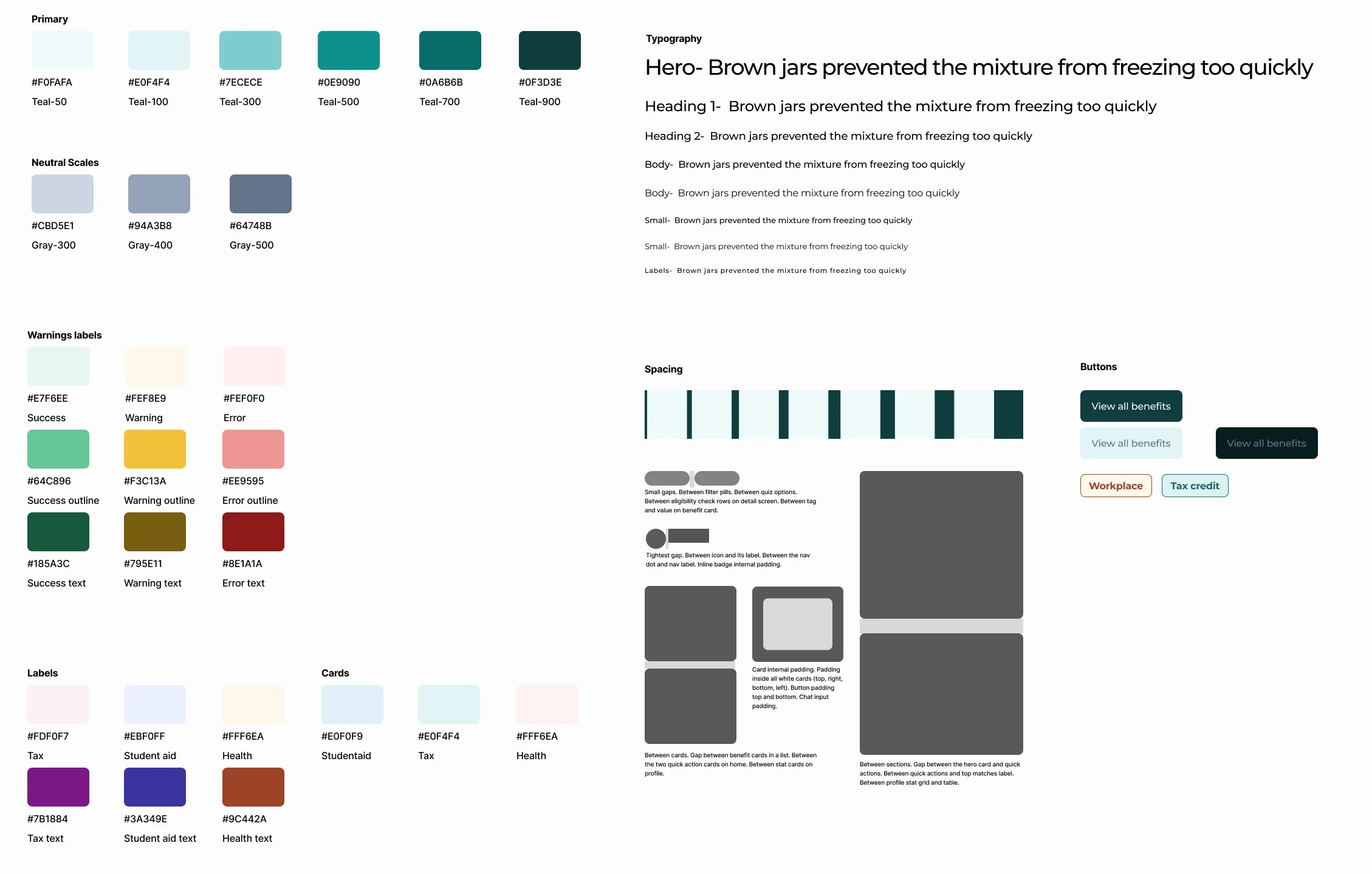
A teal scale, neutral greys, and success/warning/error states, each with a fill, outline, and text variant. Category labels use the same three-part structure:
Spacing is named by where it's used rather than by scale number: tightest between an icon and its label, small between filter pills or quiz options, larger between cards, largest between sections.
An early direction we dropped
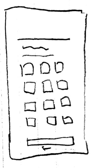
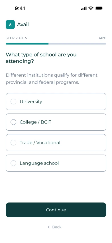
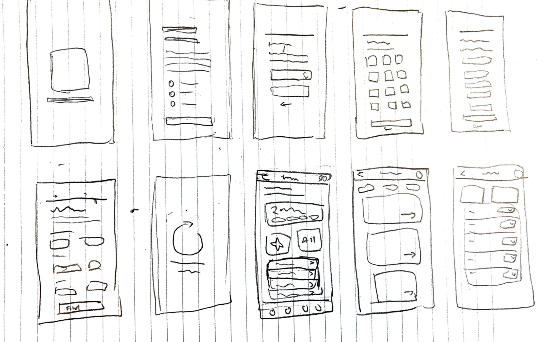
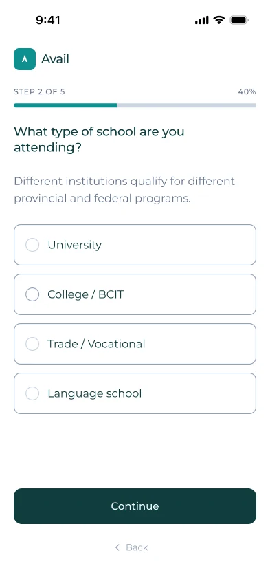
In some of our early iterations, we explored an icon grid. However, we felt like icons couldn't show the same nuance these answers really needed. For instance, income brackets or immigration status don't really have an icon or symbol to represent them. We also cut the number of options per screen, aiming for four to five choices at most, since having more than seven was too much for the user to hold in mind. The final version favours a shorter list over an icon grid.

Decisions
Onboarding and results stayed simple by design. The chat prompts didn’t, until we noticed they only worked for some users.
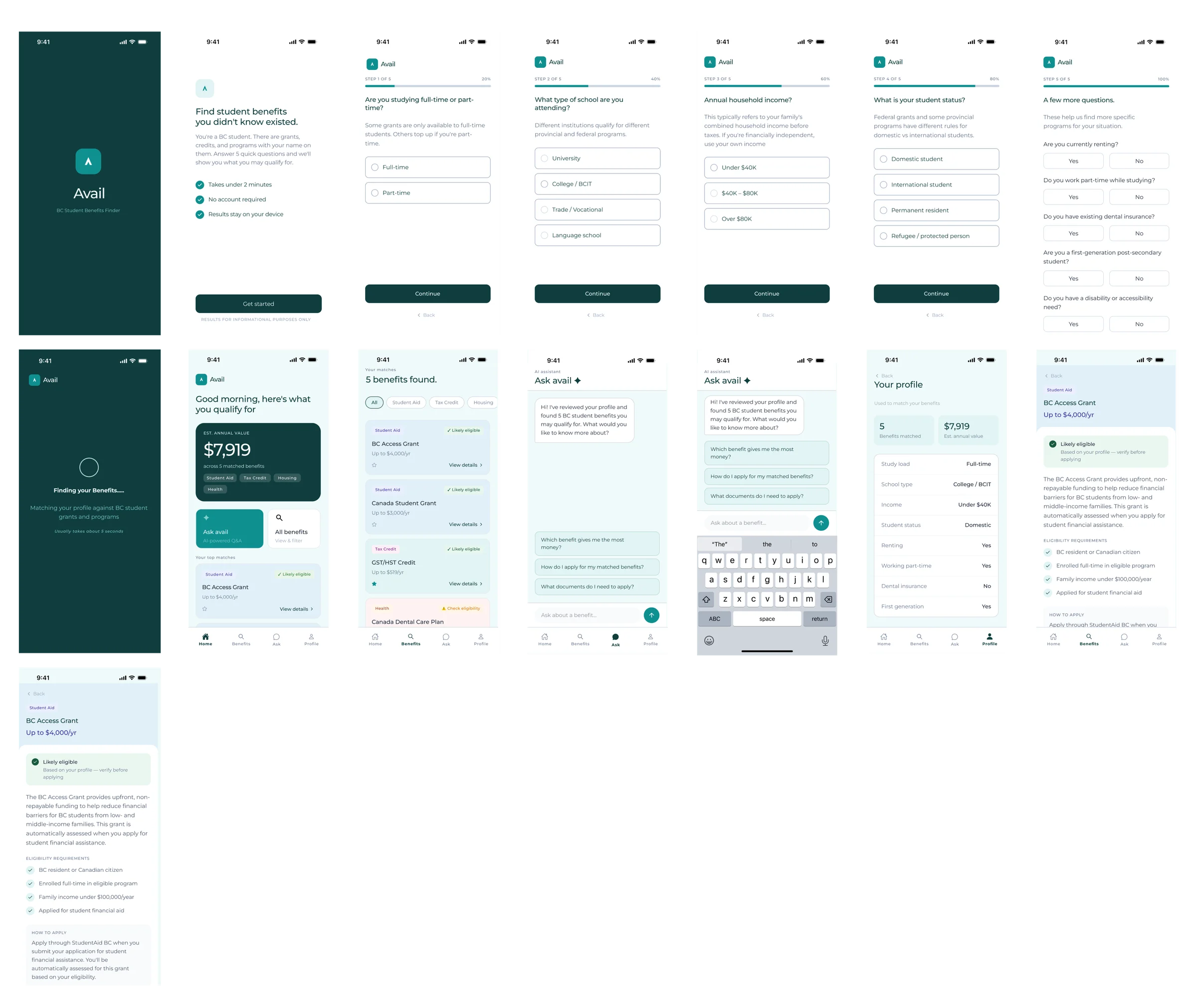
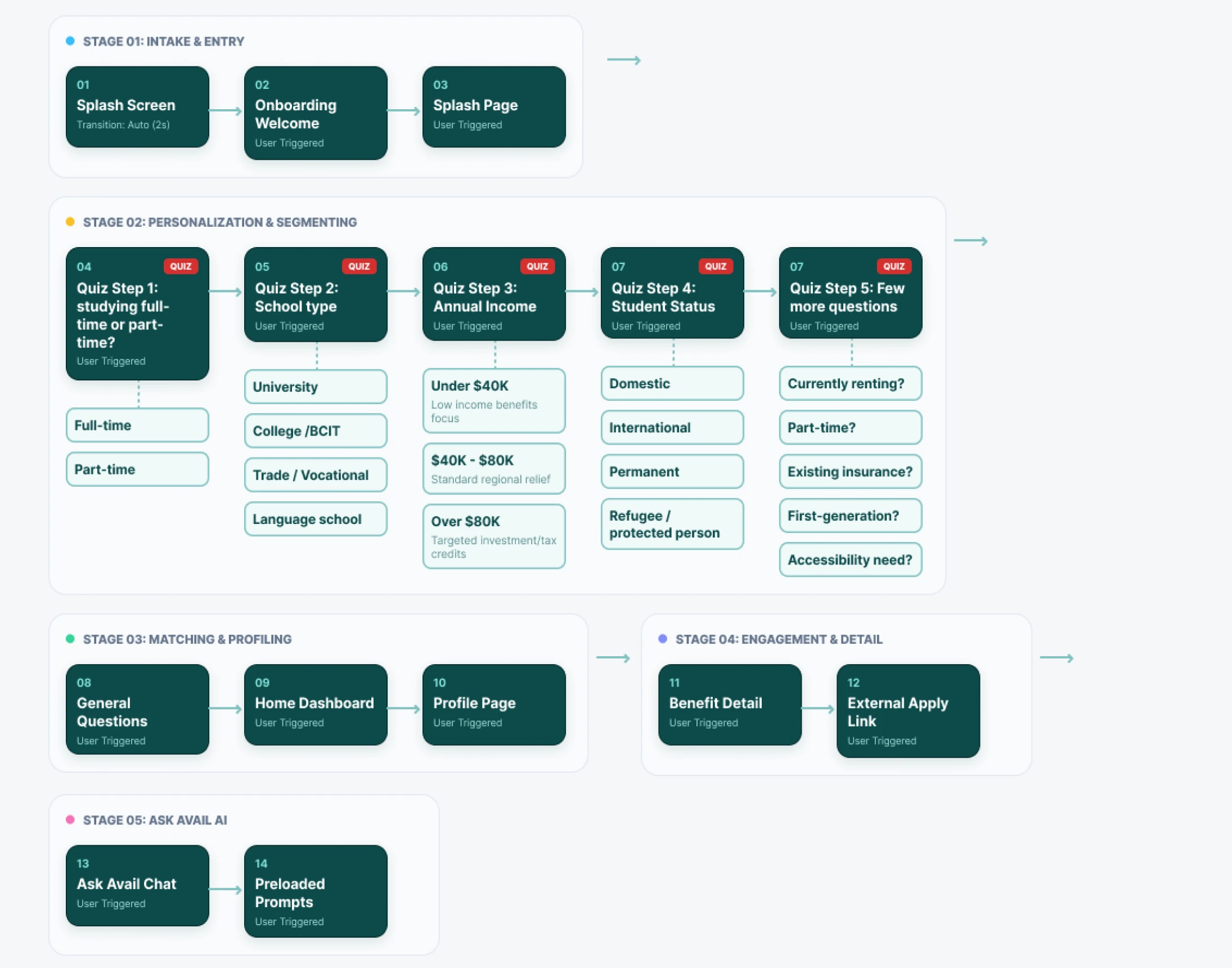
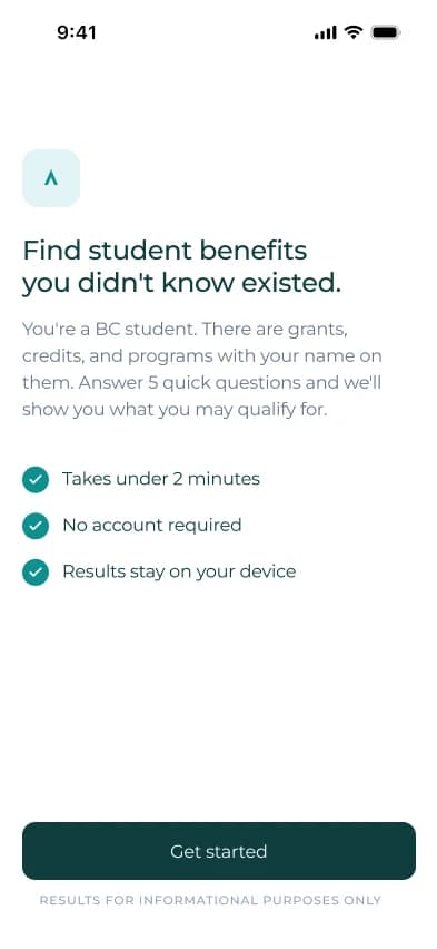
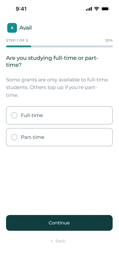
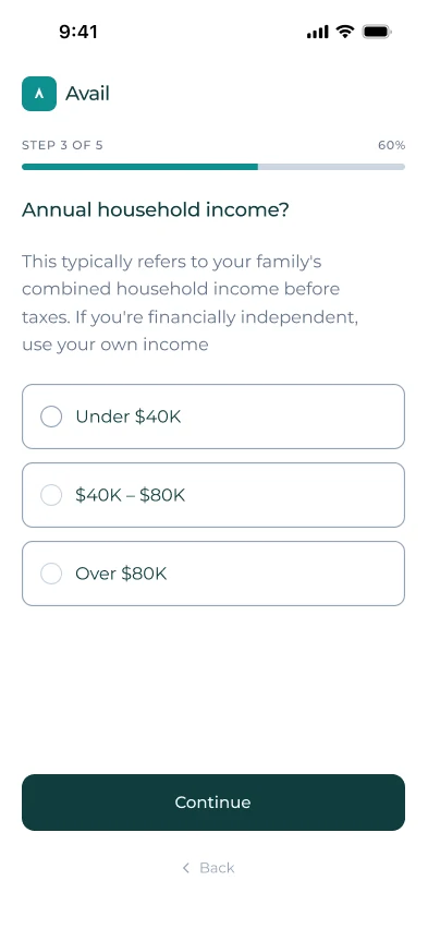
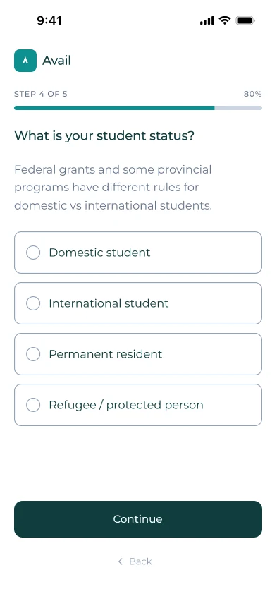
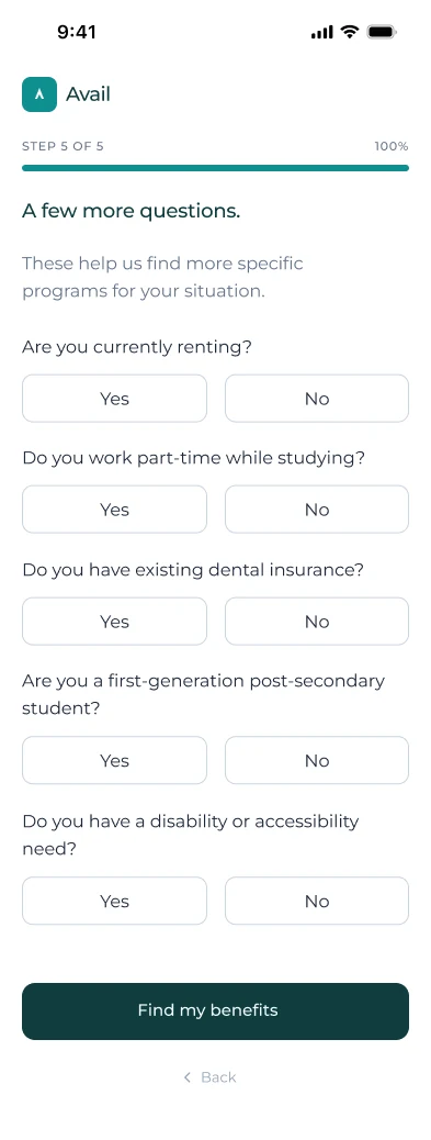
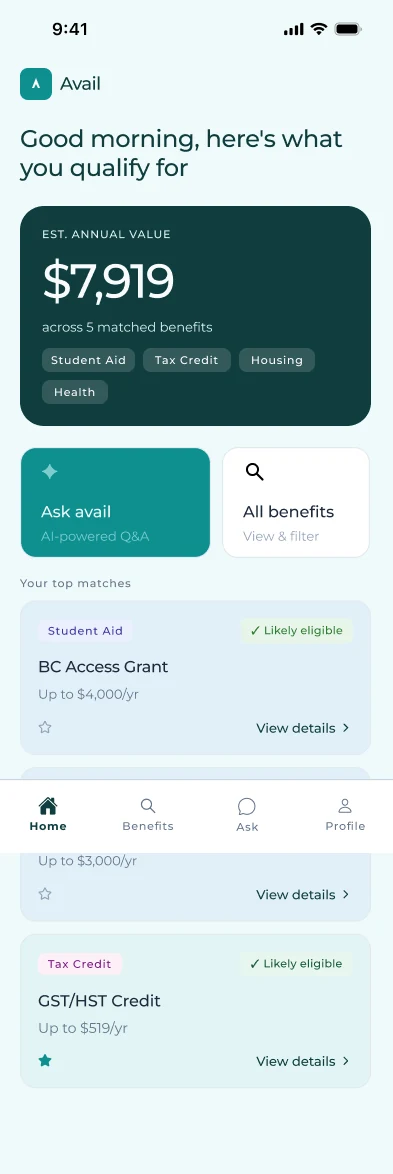
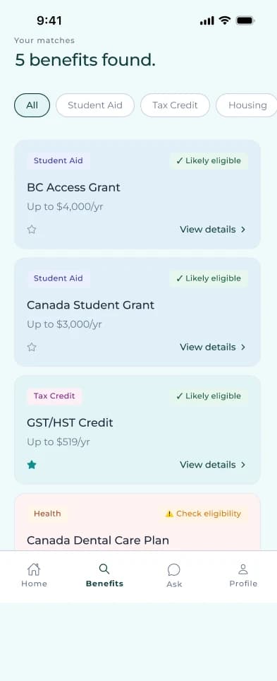
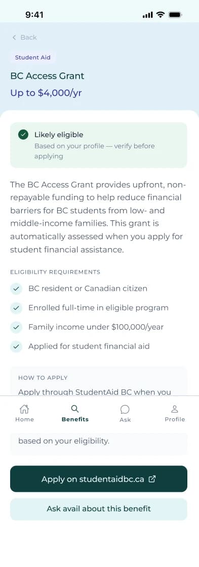
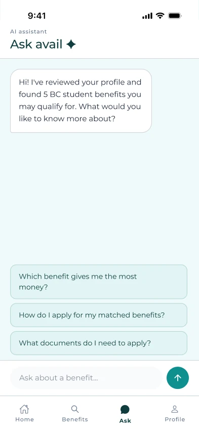
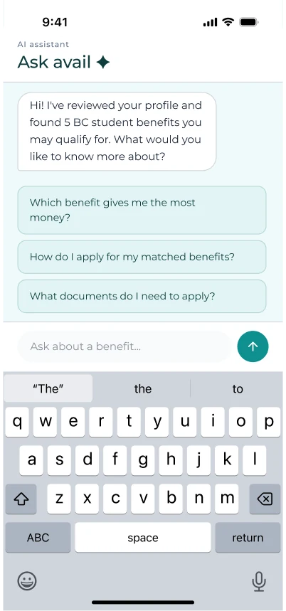
The design rests on four decisions. First, Avail positions itself as a discovery tool, not an eligibility checker, welcome copy and "likely eligible" badges make that distinction visible on screen rather than buried in fine print. Second, onboarding stays minimal: a 5-question quiz, under 2 minutes, no account required. Third, results appear in three ways depending on how deep a user wants to go, top 3 on Home, a filterable Benefits list, and a detail page with eligibility, how to apply, and a source link. Fourth, the Ask Avail chat opens with guided prompts instead of a blank search bar, since an unfamiliar AI feature already causes hesitation, and not knowing where to start would just make it worse.
Beyond the UX, a few technical calls changed what was possible. Claude handled benefit matching since no unified government API exists to integrate against, Sonnet ran matching where accuracy mattered most, Haiku ran the cheaper, faster chat. Everything lives in local AsyncStorage, no backend, keeping sensitive fields like immigration status on-device.
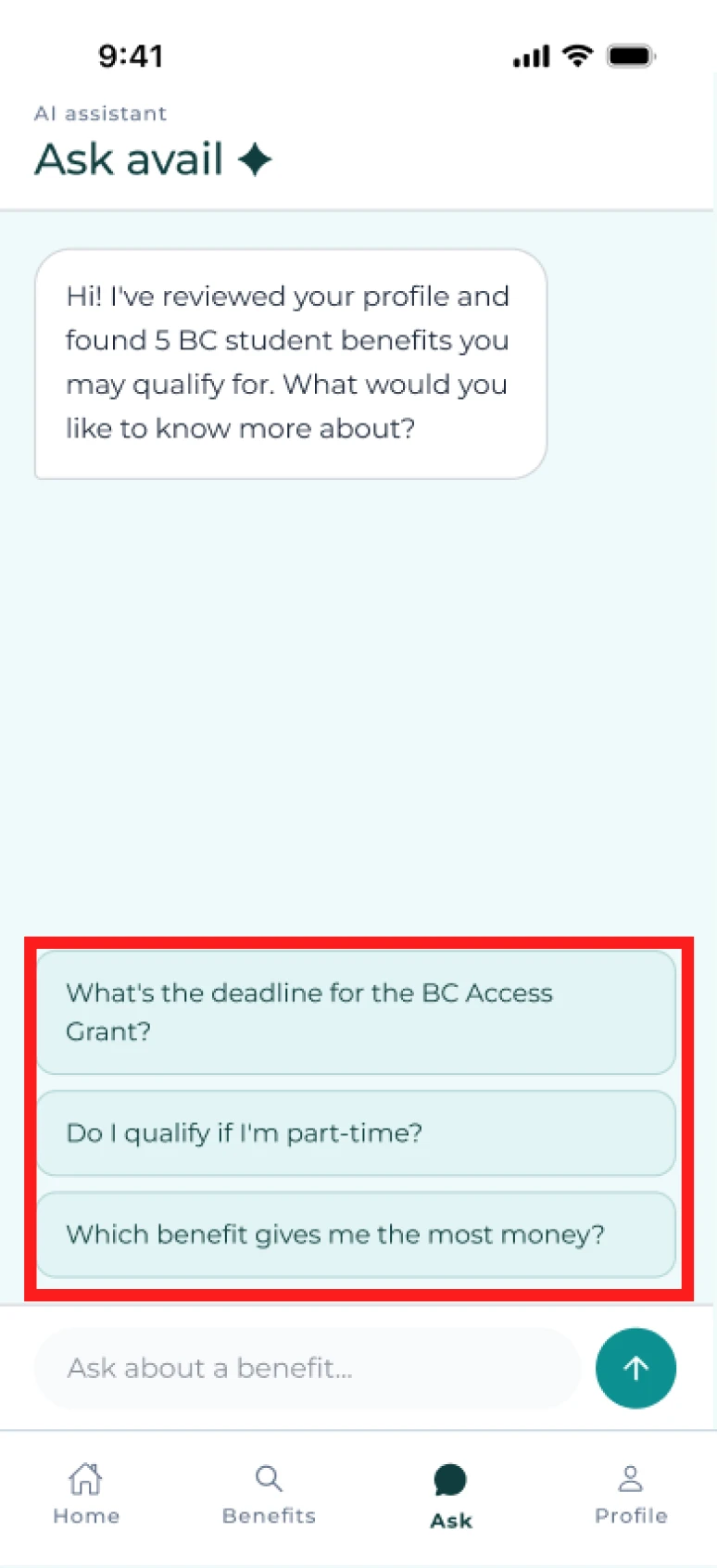
The Ask Avail chat's guided prompts needed their own adjustments as well. The first version referenced a specific benefit and condition directly, "What's the deadline for the BC Access Grant?", "Do I qualify if I'm part-time?" Fine if that's what a user matched with, confusing if it wasn't.
Before
What's the deadline for the BC Access Grant?
Do I qualify if I'm part-time?
Which benefit gives me the most money?
After
Which benefit gives me the most money?
How do I apply for my matched benefits?
What documents do I need to apply?
We rewrote the suggested prompts to match regardless of which benefits a user actually matched with: "Which benefit gives me the most money?", "How do I apply for my matched benefits?", "What documents do I need to apply?" Moreover, the user is already matched with the benefits based on their selection on the home, benefits page, and details page, so they will have a good idea on what they may want to ask Avail's chat already.
The Screens
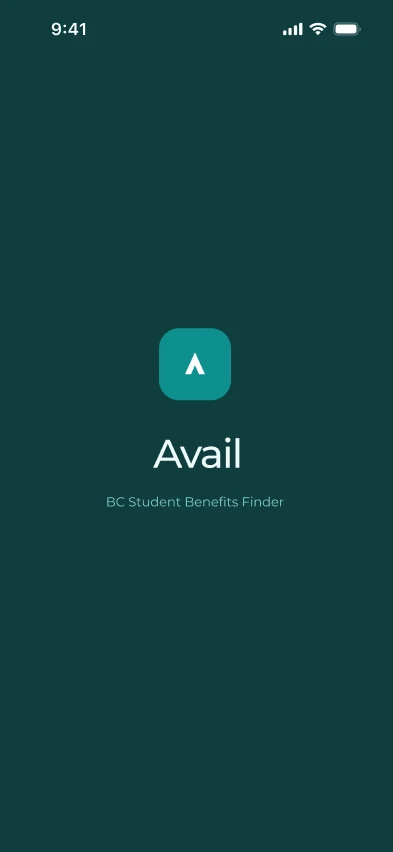
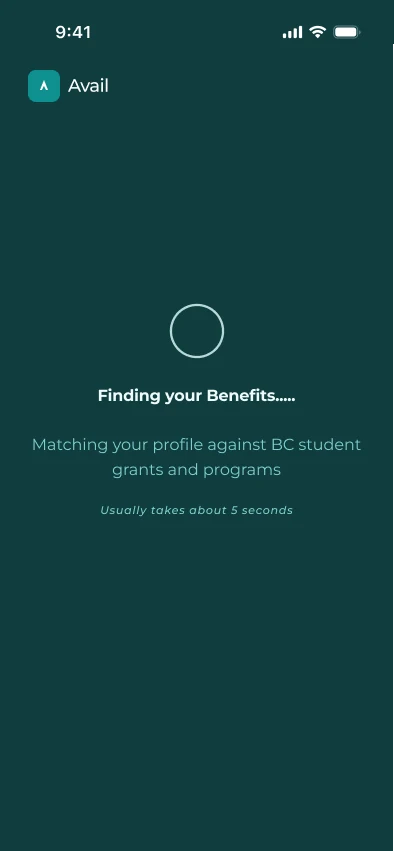
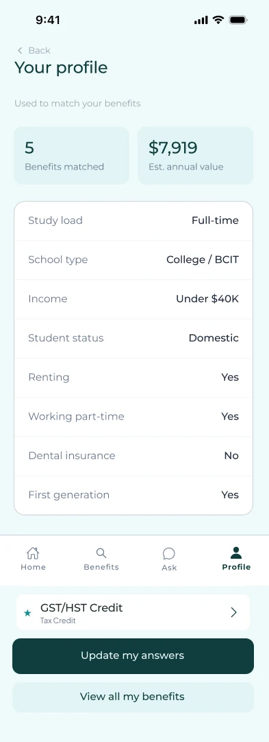
The full flow, frame by frame: onboarding through to a matched benefit, browsing, chat, and profile.
Reflection
Building the design system before dividing screens changed how cleanly this translated into real code.
I used auto-layout from the start, not just at handoff. The Design System section shows the token structure that came out of it. It kept the team consistent, and it's what let the Expo build the developer created match the Figma file with little back-and-forth. That clean handoff also meant more of the four weeks went into getting the matching logic right.
Some other key takeaways from this project:
01
A confident first scope is often the wrong one
The original proposal covered all of Canada. One piece of outside feedback showed that ambition without a real data source just produces answers you can't back up. Narrowing to BC students was the version we could actually execute under limited time.
02
Testing your own product catches problems fast, and has limits
Walking through the Ask screen ourselves caught prompts that only worked for one kind of match. Cheap and fast, but not a substitute for testing with people who didn't build it, which this project hasn't had yet. If this continued past the course, the next step is putting the quiz and chat in front of 5 to 10 BC students and seeing where the guided prompts still miss what they'd ask.
03
AI matching is only as trustworthy as what you check it against
Claude's matching was validated against the eligibility criteria we hand-checked, not against edge cases we didn't think to test. With more time, that's where I'd focus next: stress-testing matches against messier student situations before trusting the output.
Other works
 View project
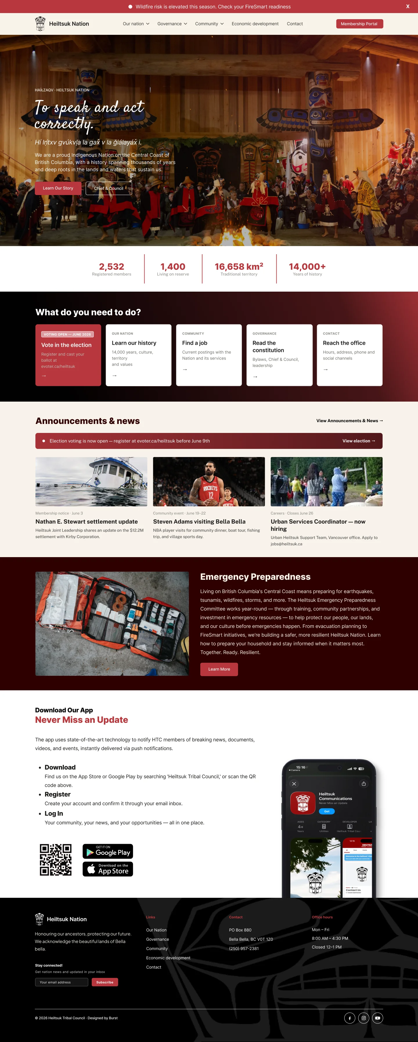
Building Heiltsuk Nation's site to grow, not just to be patched together.
 View project
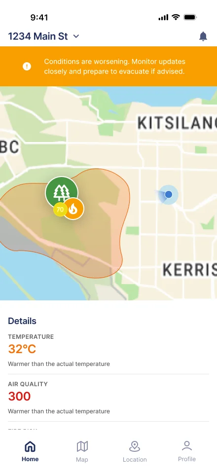
A wildfire alert app built to guide action, not just relay information.
 Coming soon