


Burst! Creative Group
Building Heiltsuk Nation’s site to grow, not just to be patched together.
My Contributions
Research
UI Design
Usability testing
Prototyping
User research
Responsiveness
Client
Heiltsuk Nation
Team
1 Product manager
1 Lead designer
1 Product designer (me)
Duration
6 weeks
Tools
Figma, AI, Illustrator
Overview
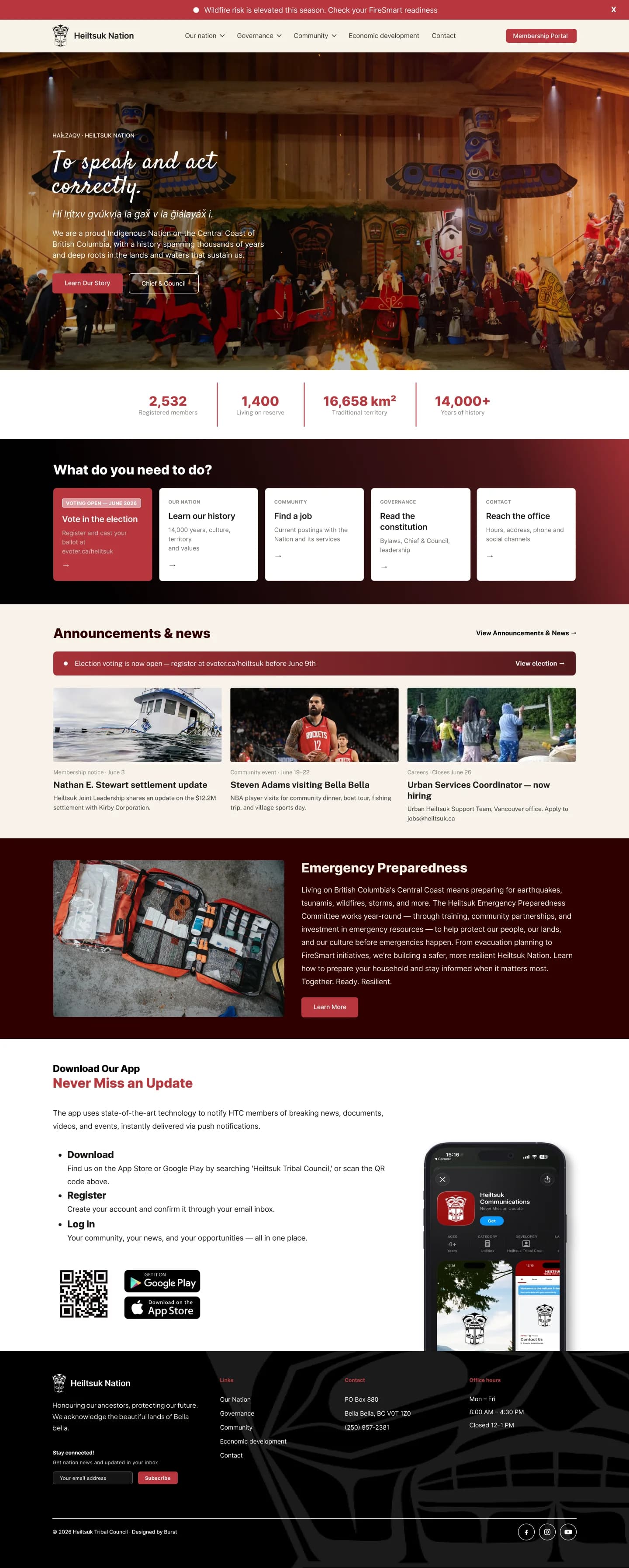
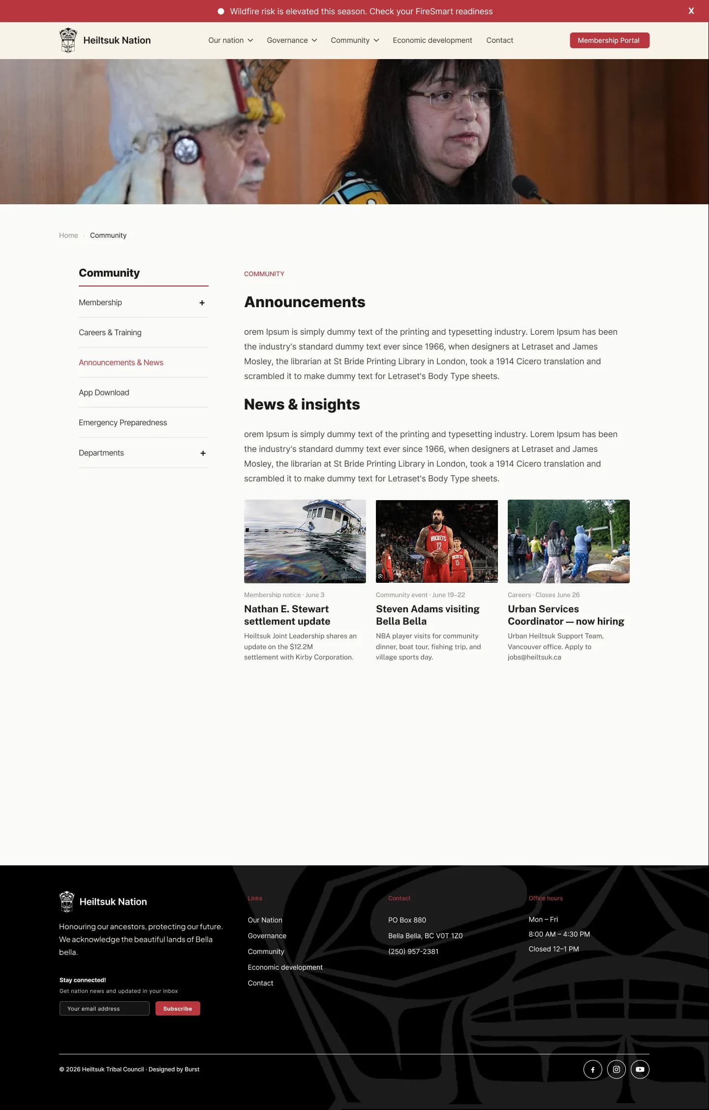
Heiltsuk Nation's (Client) website is a single scrolling homepage — as their content grew, they faced challenges in organizing new material and integrating sub-categories into the existing structure. Burst! Creative Group brought me on to this project during my internship to rebuild it as a structured, scalable website using the Client's colours and typefaces. I was appointed to be the lead designer on the project with only a few weeks left before my internship ended. I used Claude Design to speed up the brainstorm-to-mid-fidelity process, then built and tested the pages one at a time. By handoff, I had already incorporated most of the Client's content without needing a redesign. Before I left Burst!, I built a separate set of mobile screens and wrote developer comments so the project could be handed off smoothly to the next Lead.

Problem
Every new content added a longer scroll, and the sub-categories the client wanted outgrew the format.
I was first brought in to update sections of the existing site. Each addition made the page longer making it harder to navigate. The client also wanted sub-categories within sections, something a single scrolling page has no way to represent. A user also didn't have the ability to see news and announcements because that section didn't exist. This would have a large impact on the nation's website SEO, discoverability, conversion, funnel metrics, bounce rates, and shareability just to name a few.
A giveaway promotion and a visitor announcement both needed a News or Announcements section that simply didn't exist, and there was no sensible way to add one to a page that only scrolled, and already had so many navigation items. So instead, they both became pop-ups. Rebuilding the site meant giving new content an actual section to live in, not another paragraph tacked onto an already-long page.
Discovery
We gathered requirements from the Heiltsuk Nation, and I worked with my PM to synthesize.
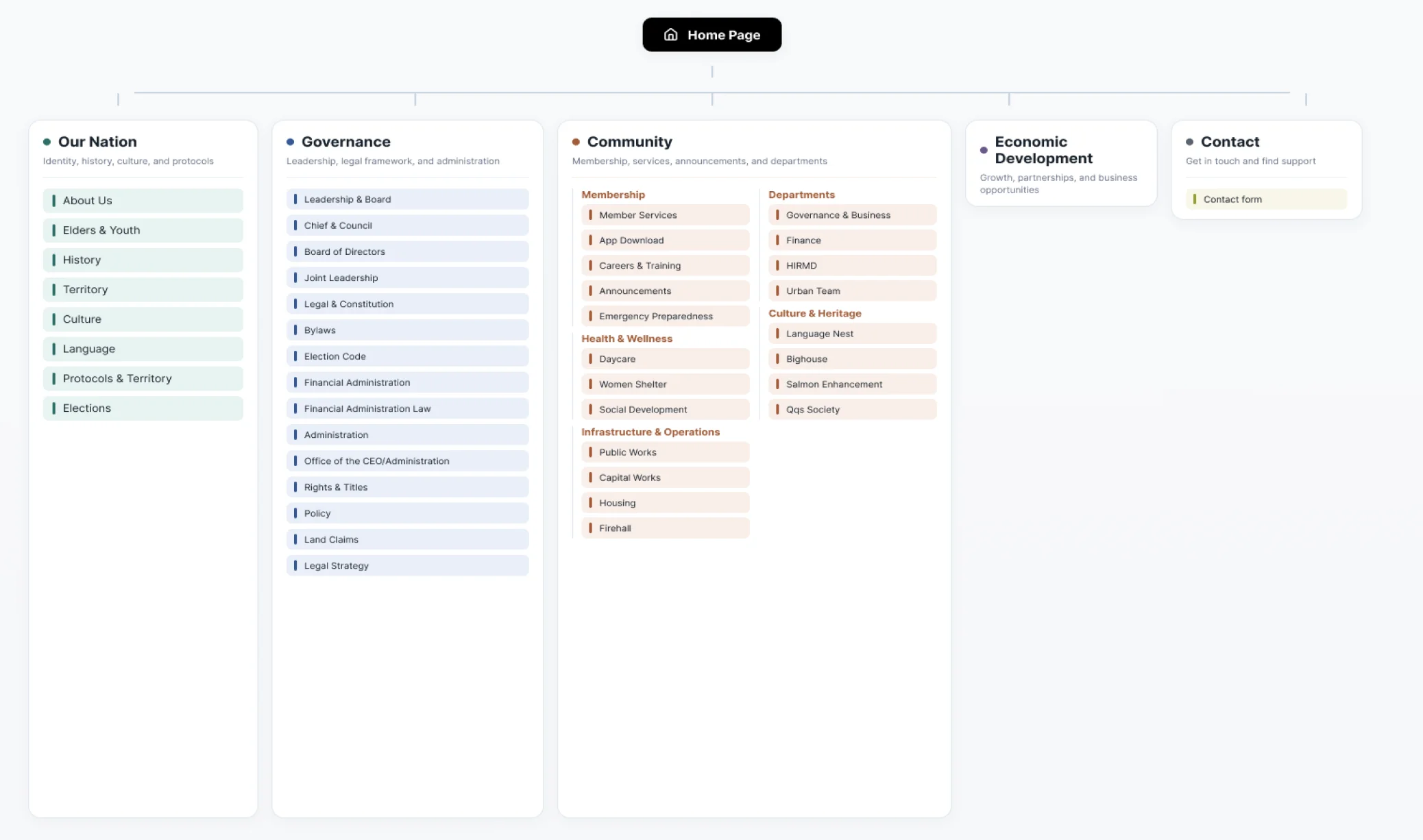
My lead and I gathered requirements directly from the Heiltsuk Nation, who wanted to add substantial new content, including departments, emergency readiness information, and more, much of which the current site structure couldn't support. My lead led the calls while I synthesized the findings and rebuilt the sitemap. It quickly became clear that the requested additions didn't fit within the existing structure, which meant the project needed more design thought rather than a simple content update.
Ideation
Since I was the main designer, with some direction from our lead, and the tight timeline, I used AI tooling to brainstorm and prototype quicker.
My lead was focused on other projects, which put me in the main design seat. With only a few weeks left in the internship, we agreed on using Claude Design to move faster. I explored early directions directly with Claude Design, generated a range of variations to gather feedback, then refined and polished the final work in Figma.
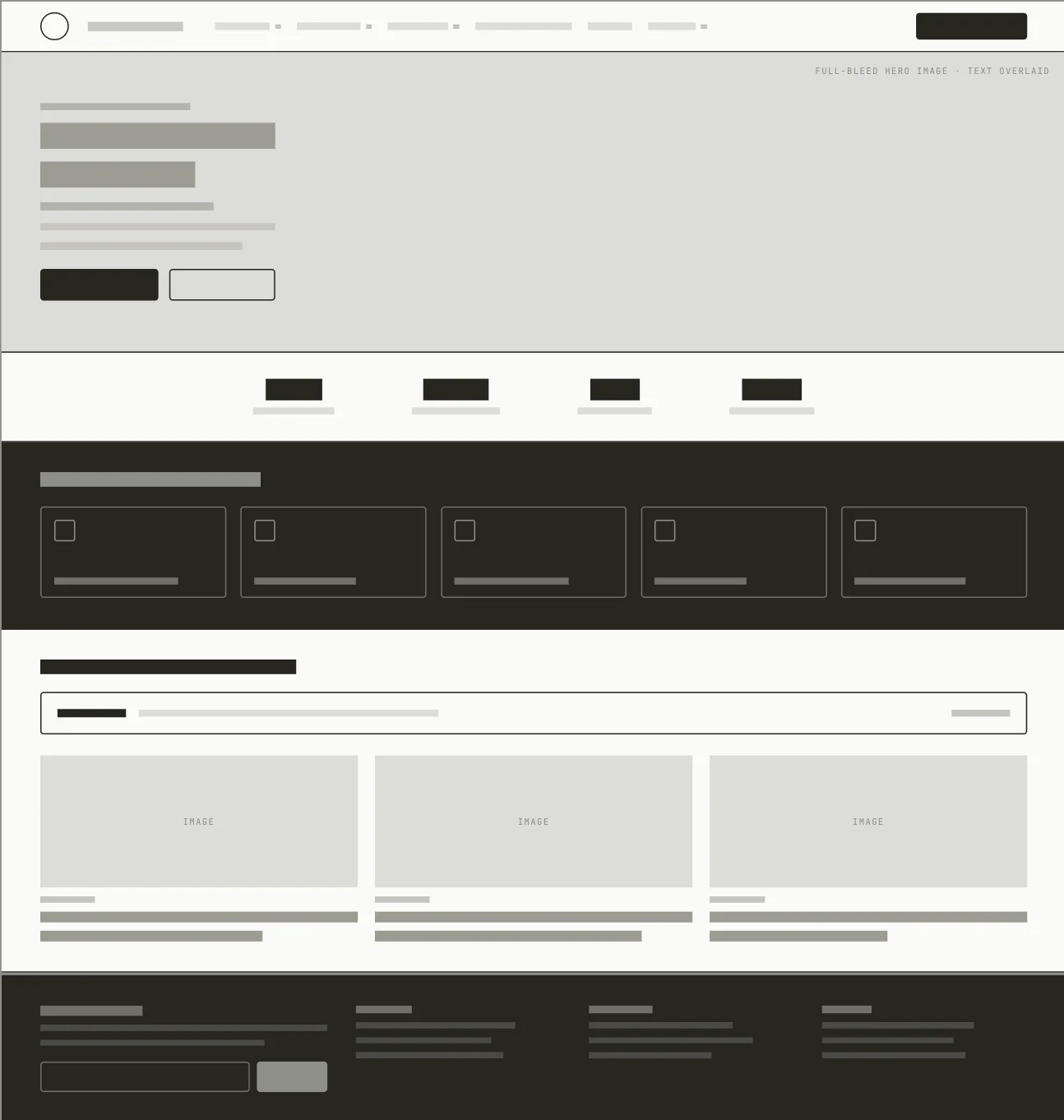
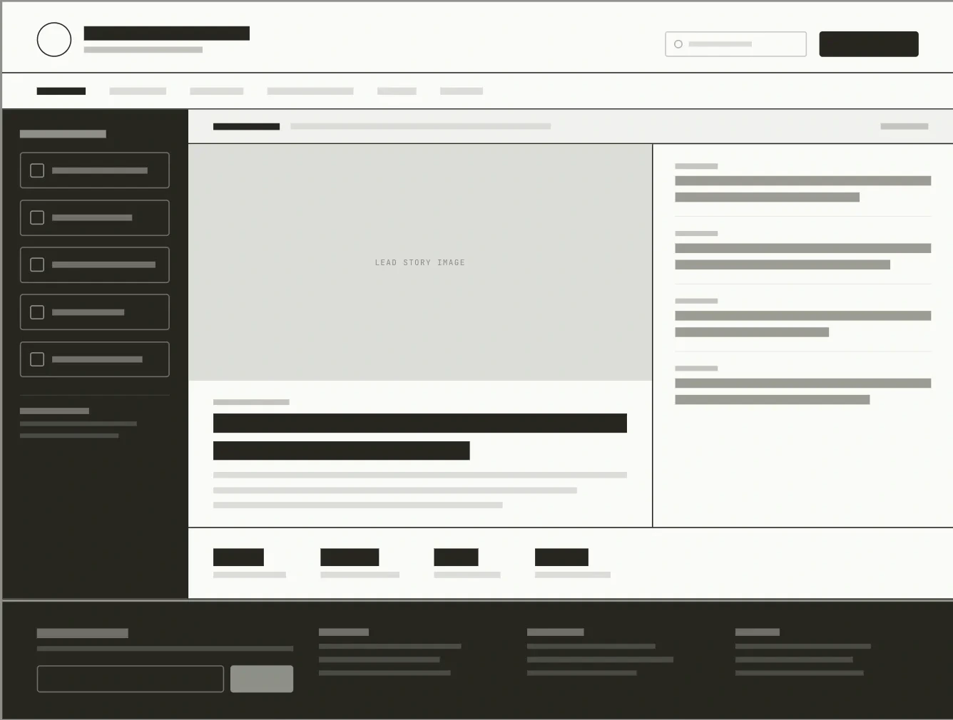
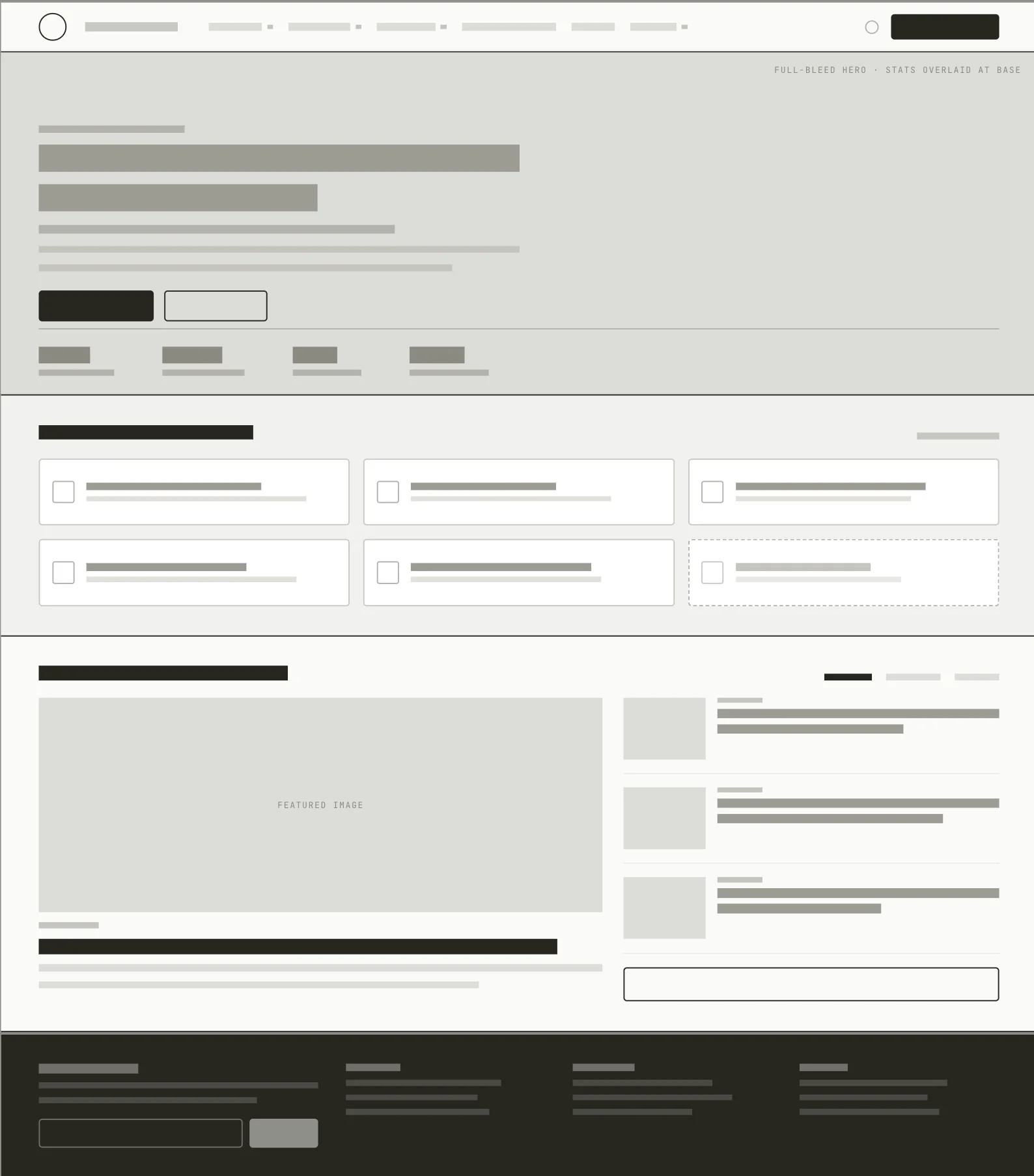
Early feedback
After my designs were reviewed and approved, we started working directly with the client on the copy to pressure test the designs.
I built each page as a fully interactive prototype and tested it directly with the client, gathering feedback from both internal team members and the client's side. That feedback was folded back into the prototype iteratively. The payoff came later: the same category-page template held up across completely different sections, proof that the structure wasn't just working for one part of the site.
The mega-menu concept
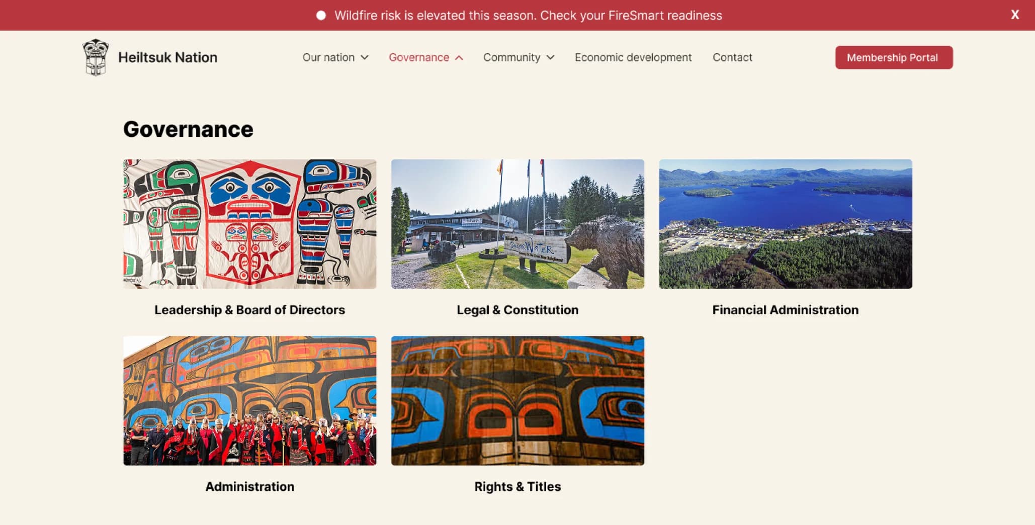
We discovered a traditional dropdown didn't fit the client's needs. That led to the mega menu concept, designed to showcase land and community imagery alongside the navigation itself rather than treating it as a plain text menu. The client loved the direction and wanted to move forward with it.
The structure was also built to scale. Some dropdowns had as few as five items, so when the client later asked to add a new topic, it dropped straight into the existing grid without requiring a redesign.
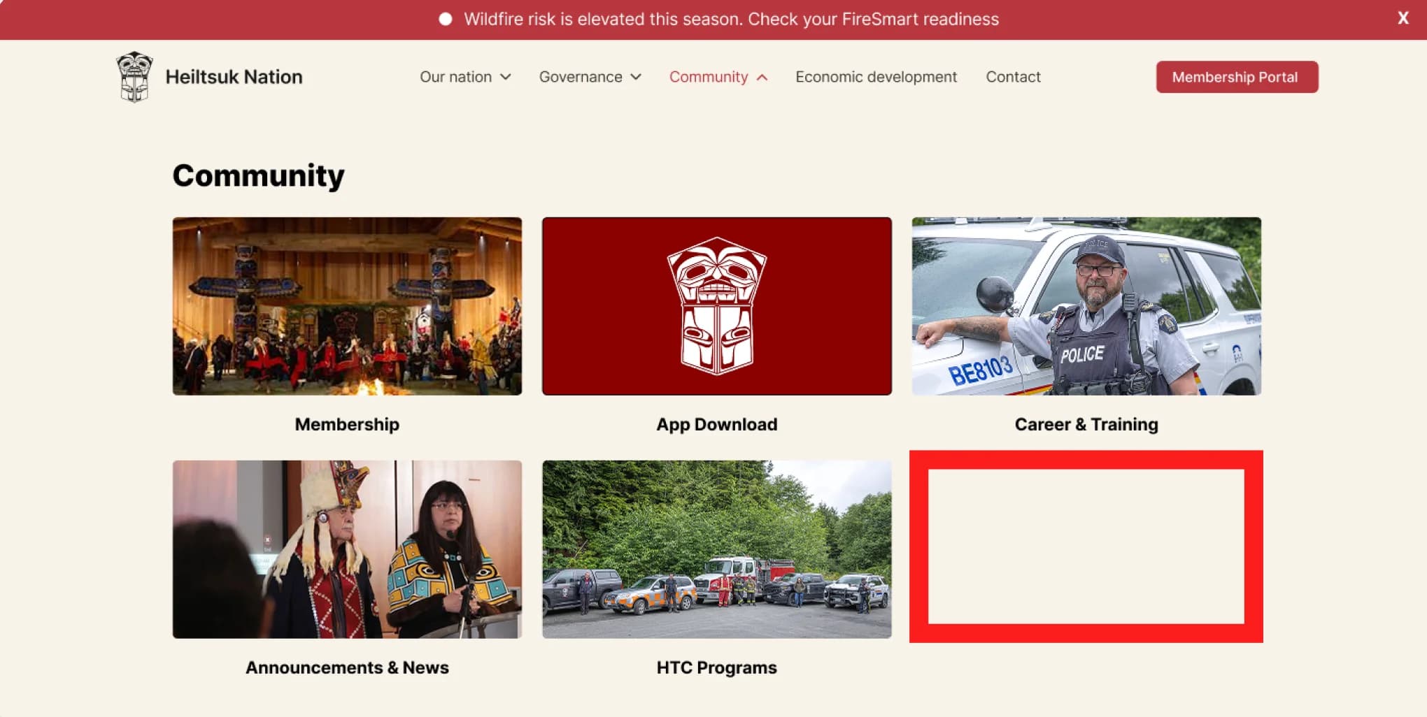
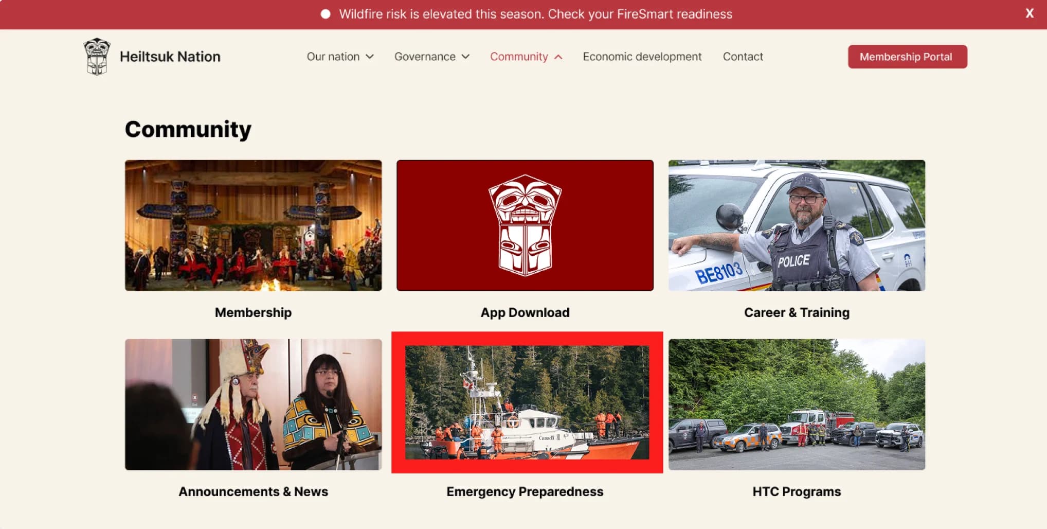
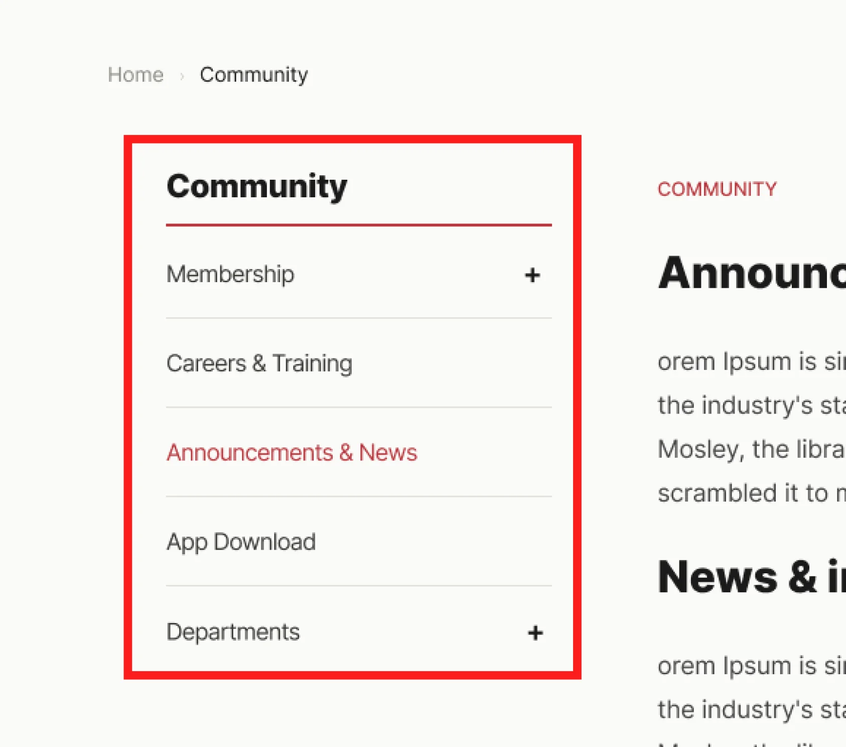
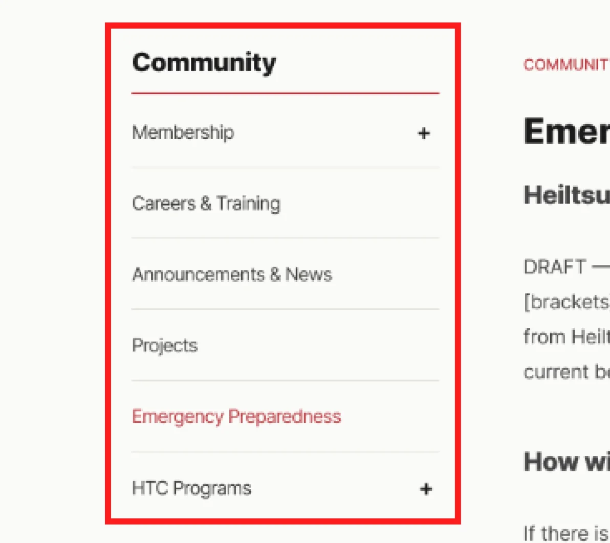
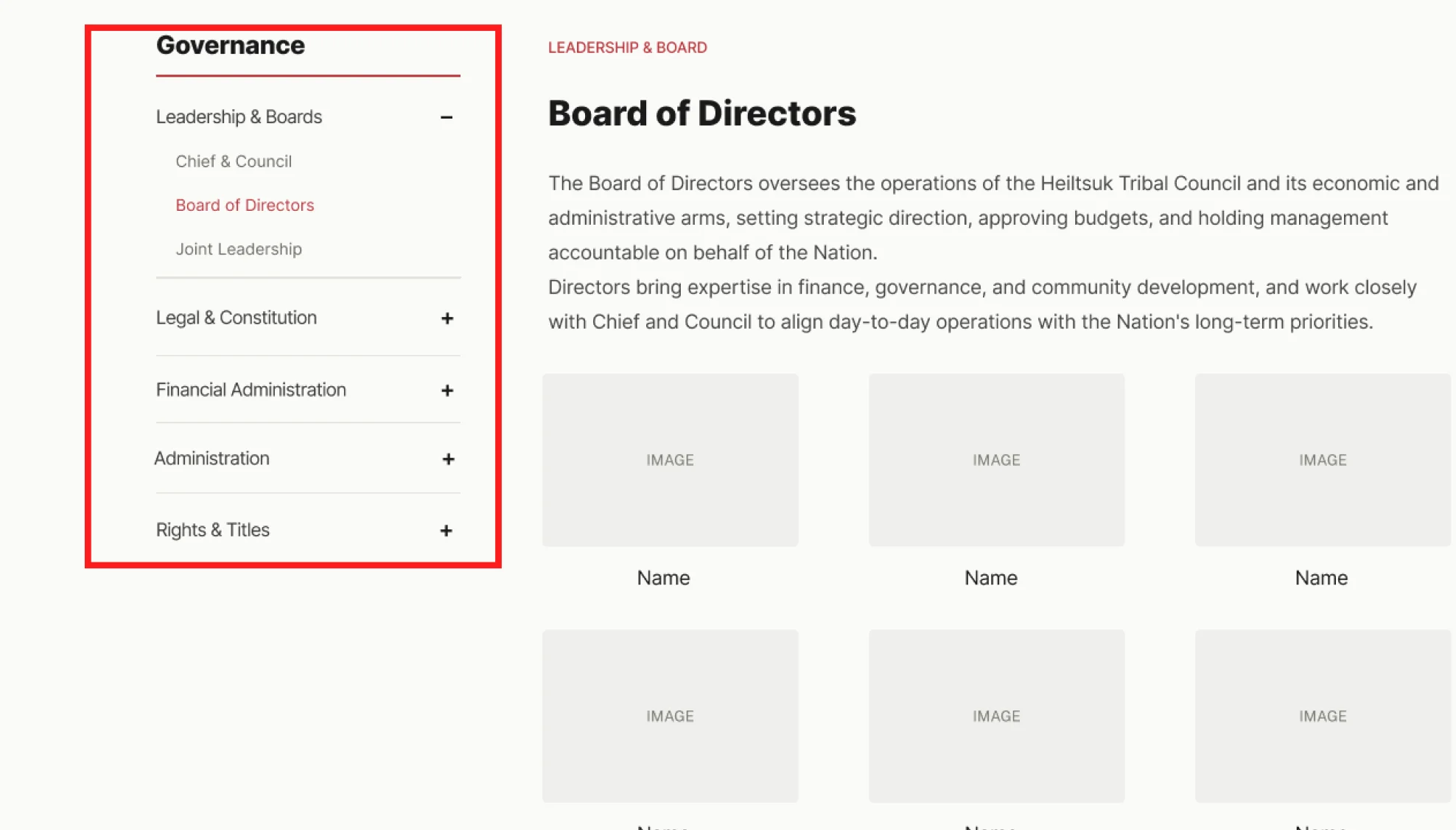
Once the mega menu was in place, each category page needed its own way to guide visitors from that broad entry point toward specific content, rather than presenting everything at once. Drawing on patterns from other sites handling deep category nesting, I designed a left-side dropdown, validated in lo-fi wireframes before carrying it into higher-fidelity pages. The result is a single nav pattern shared across every other section.
Final design
I completed the designs, but my internship ended mid-development.
Once developers started picking up the wireframes, I commented directly on interactions in Figma so the intent didn't depend on someone asking me. I also built a separate set of mobile screens, since the desktop layout didn't make mobile behaviour obvious, and I wouldn't be there after the internship ended to answer questions about it. The mobile mock-up would show the developers how the interactions should work. However, if something was still not making sense, I made sure to continue to make myself available to them.


Reflection
Even though the site hadn’t launched by the end of my internship, the experience shaped how I think about pacing, documentation, and where AI fits into a design process.
Knowing from the start that I had a few weeks, I could have worked faster and tightened the feedback loops earlier than I did. This was also my first time leading a project of this scope, being the sole designer on the team meant I was learning that pacing on the fly rather than following an established rhythm.
I also learned the value of writing thorough handoff notes. Since the site hadn't launched by the time my internship ended, the next person needed to be able to pick up the project without me there to explain context in person. That meant documenting decisions and reasoning in enough depth that someone unfamiliar with the process could still move forward with it.
AI tooling played a real role in expediting the work. It didn't replace design judgment, but it gave me a way to move faster at a stage where I was the only designer driving the process, especially useful given the timeline.
The clearest proof point that the work held up: the category structure survived new content without needing a rebuild, even though the site itself hadn't launched by the end of the internship.
Other works
 View project
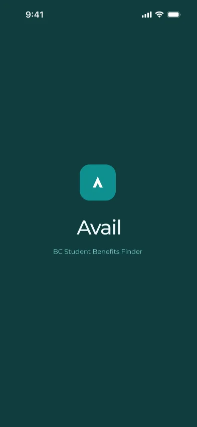
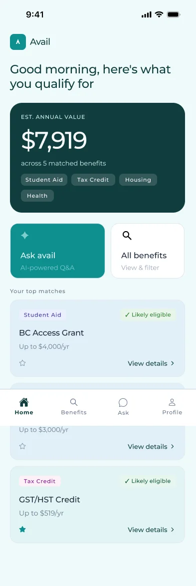
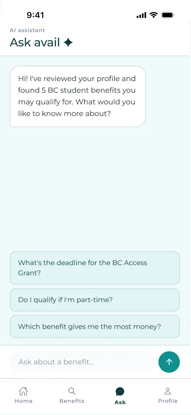
Creating an app that helps BC Students Claim the Benefits they're already owed.
 View project
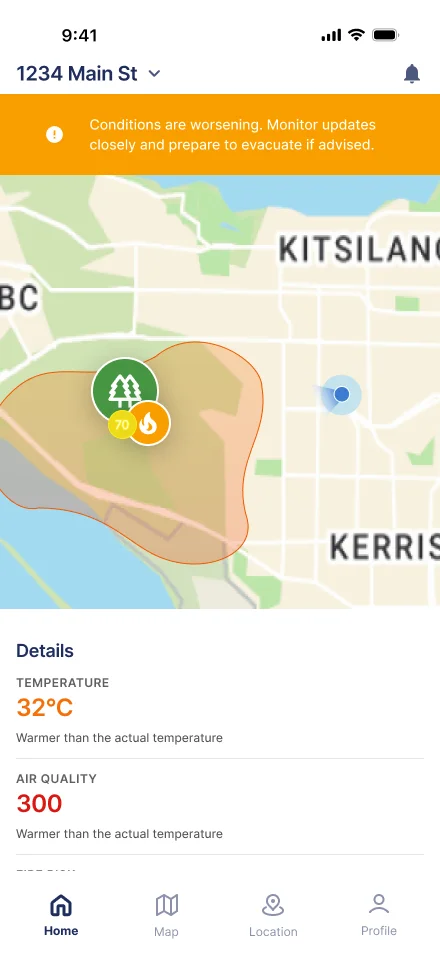
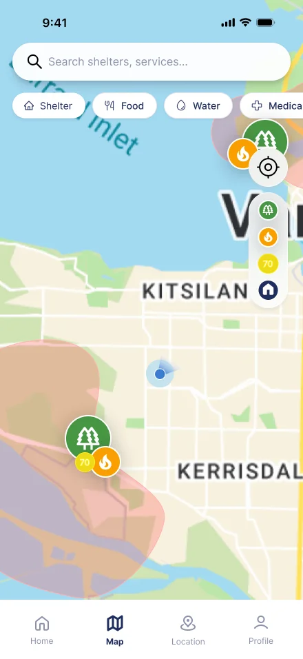
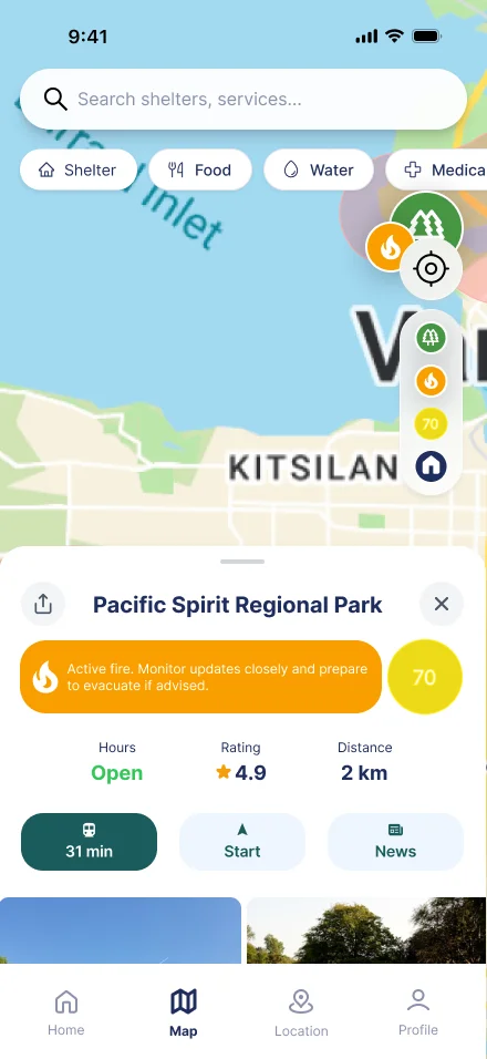
A wildfire alert app built to guide action, not just relay information.
 Coming soon